All work

Facctum (Light)

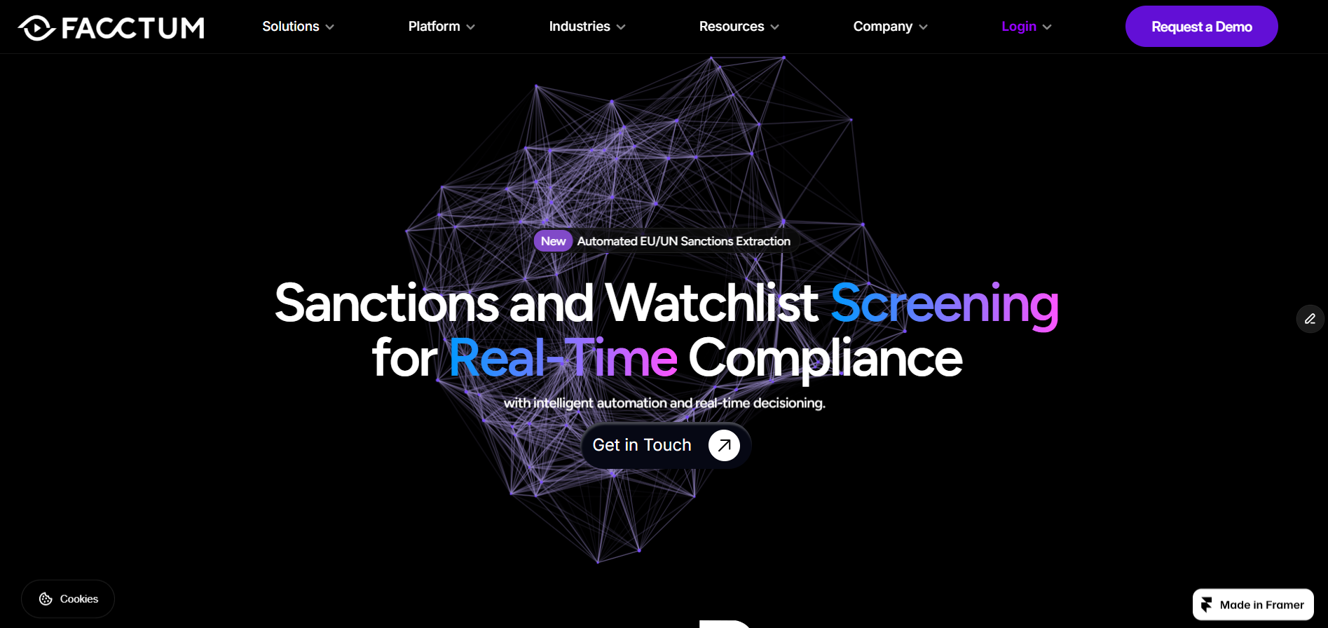
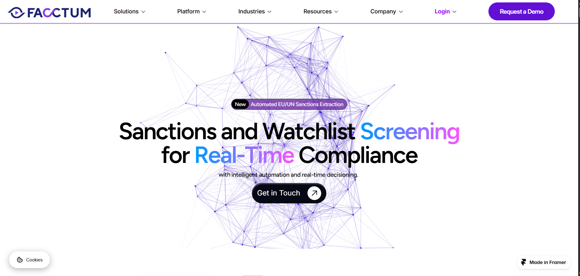
Produced alongside the dark variant during a previous employment with Facctum, this version explores a clean, corporate light palette while keeping the same content structure and functionality. Neither version was adopted as the company's live site. Included here as an example of multi-theme design execution in Framer.

Project

Context
Internal Concept Build
Platform
Framer
Timeline
2 Months
Built with
Framer
View the live site
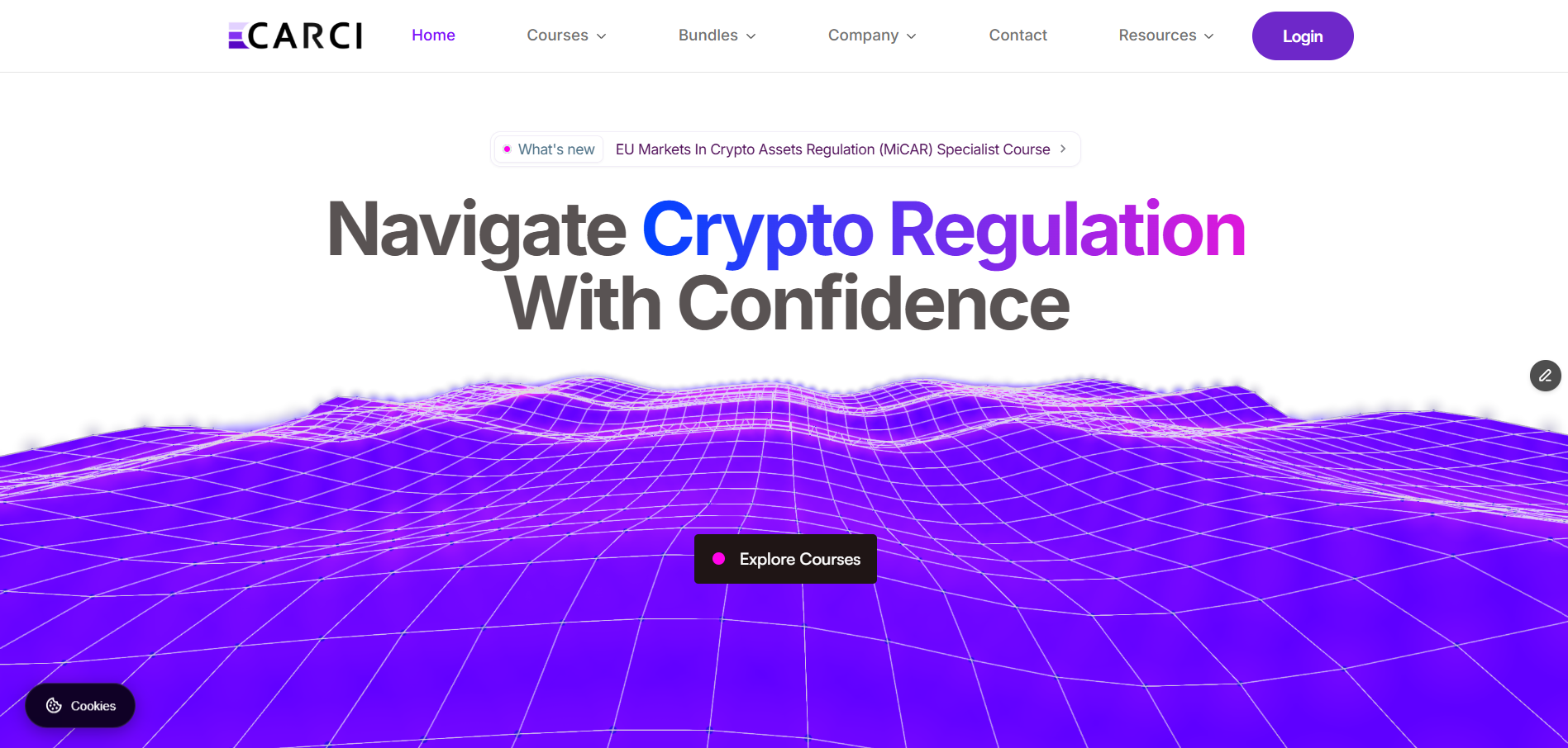
Facctum (Light) website, homepage

A light-theme variant of the same concept, produced to test how far the system could stretch without rebuilding the content structure.

Why build a second theme

Enterprise buyers often push back on dark interfaces. Producing a light variant on the same component system tested whether the design held up when the atmosphere was removed.

What changed and what did not

Content structure, page hierarchy and component behaviour were identical. Only surface, contrast and imagery treatment changed.

  • Shared spacing scale and type ramp across both themes.
  • Colour handled through tokens rather than per-component values.
  • Identical URL and heading structure, so SEO work carried across untouched.
Reuse

Same components

Theme swap without structural rework.

Status

Not adopted

Exploration only, shown as design evidence.

Value

Design system proof

Demonstrates token-driven theming.

What we took from it

Building a light version of the same product was a useful test of how well the original was structured.

  • If a design only works in dark mode, the underlying hierarchy is usually too weak.
  • Token-based colour makes a second theme a day of work rather than a second project.

Questions

Neither was adopted. The light theme tested better with conservative enterprise stakeholders, the dark theme communicated technical precision more strongly.