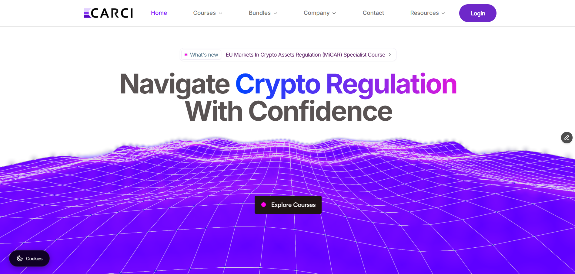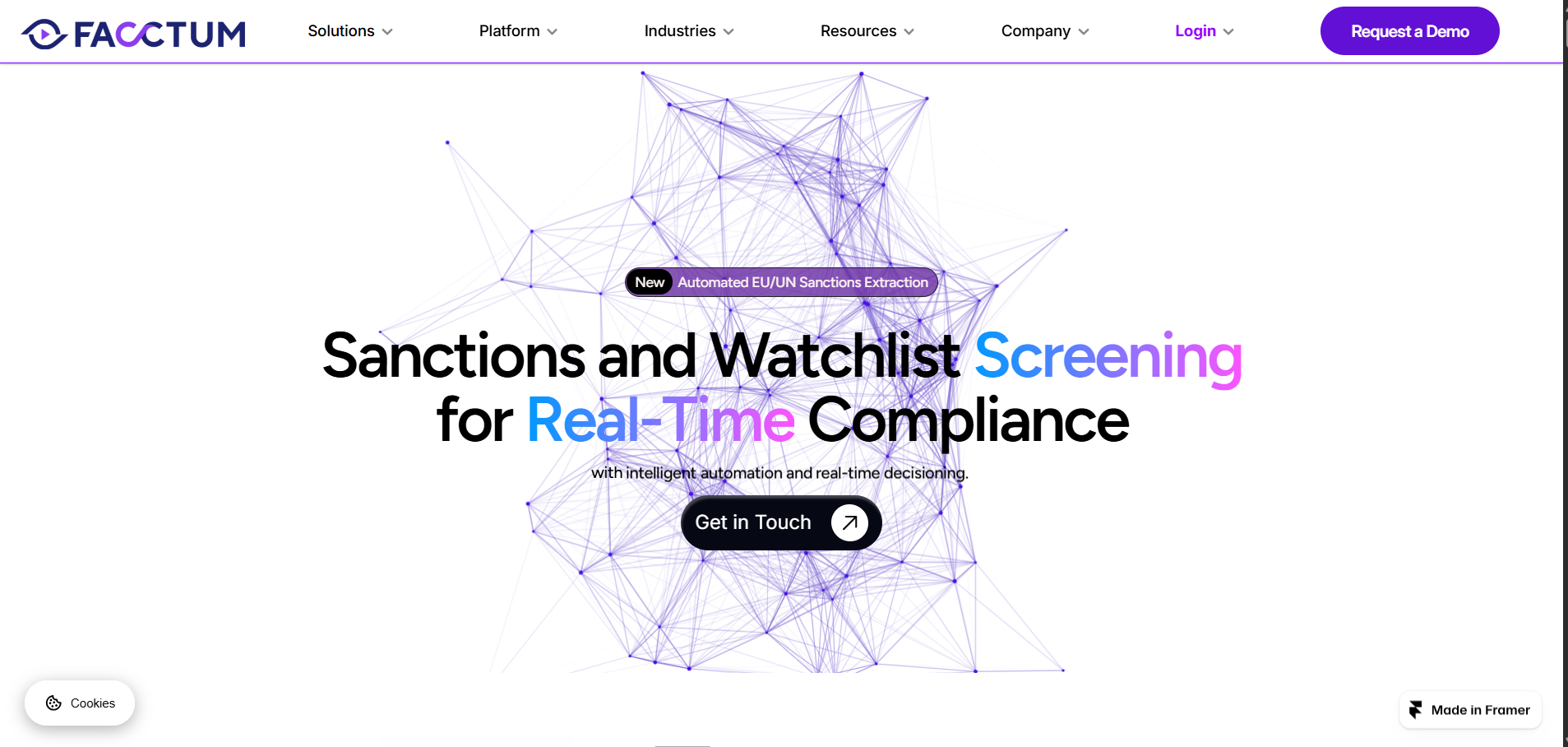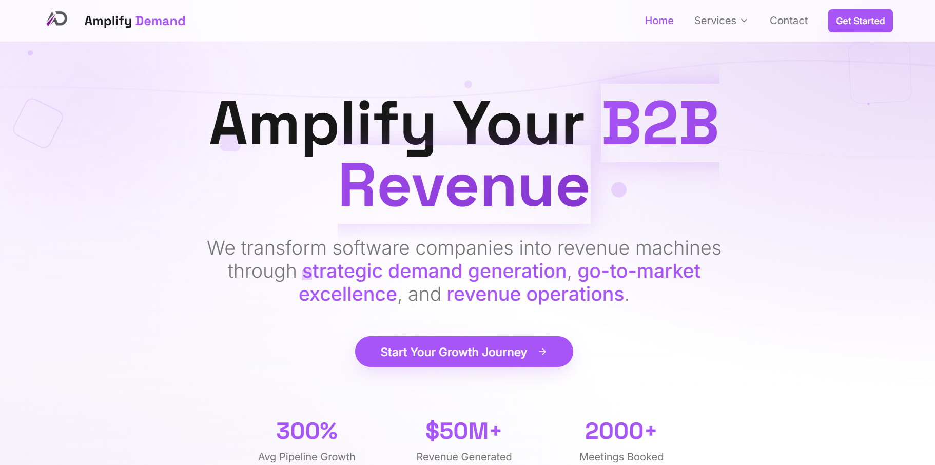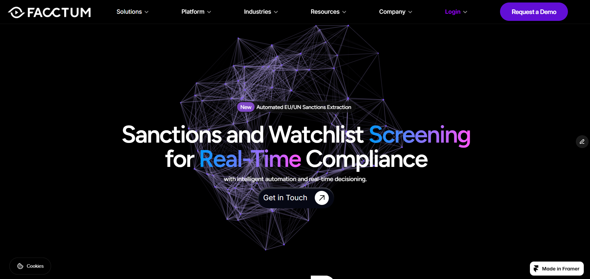
An internal design exploration for a sanctions screening platform, produced during a previous employment and not adopted as the live site.
The problem with screening software sites
Sanctions screening is a real-time, technical product, but most vendor sites describe it in abstract enterprise language. The exploration set out to show the mechanism instead of describing it.
- Visualise the screening flow rather than listing features.
- Give technical buyers depth without burying the commercial message.
- Use a dark, instrument-panel aesthetic to signal precision.
Motion with a job to do
Animated components were used only where they explained something: data entering the pipeline, matches being scored, false positives being filtered. Decorative motion was cut.
Content structure for technical buyers
Pages were laid out so a compliance lead and an engineer could both skim to the part they care about, with self-contained sections that stand up when extracted out of context.
- Question-led headings with direct answers underneath.
- Glossary-style definitions for domain terms.
- Clear separation between product capability and company credibility.